Why the same face keeps coming back
A generative model returns the middle of what it has seen. The screens most abundant on the public web are the SaaS landing pages and dashboard templates of the past few years, and since those resemble one another, the default a trained model reaches for lands in that middle. Different companies, different models, different projects — and the result wears the same face.
This is not incompetence. It is what happens when there is exactly one default for what to pick in the absence of direction. Until the default changes, no amount of prompt polishing keeps you from drifting back to the same spot.
So what is needed is not a better adjective but a list. Name what repeats and "it looks cheap" turns into "fix these eleven things." The open-source tool Impeccable turned that list into rules. It is a project that started from the frontend-design skill Anthropic published.
The repeating tells and what to do instead
Below are items the checker actually names and catches. Having a rule name is the point. With a name, a review can say "that is a card inside a card" instead of "something feels off," and the direction of the fix comes with it.
The right column is the alternative. Most of them subtract rather than add. Delete the stripe, return the gradient to a solid, peel off the card shell and separate with space. It sounds like the screen will get dull; in practice the information starts being visible first.
The type item is often misread. It does not mean Inter is a bad typeface — it means it is used in so many places that it no longer distinguishes your screen. The list the checker names alongside it includes Roboto, Geist, Plus Jakarta Sans, Space Grotesk and Fraunces. If the brand settled on one, record it as an exception.
| Repeating tell | Why it is a problem | What to do instead |
|---|---|---|
| Thick colored stripe on a card edge | The most recognizable tell of AI-generated UI | Remove it, or use a far subtler accent |
| Gradient laid over a heading | Decorative; it carries no meaning | Solid color. Emphasize with size and weight |
| Purple-to-blue background | The signature color pairing of AI output | Use the palette the brand settled on |
| Gray text on a colored background | Contrast collapses and it reads washed out | White, or a darker shade of that background |
| Colored glow spread around a shadow | A default attempt to look cool | Neutral shadow expressing elevation only |
| Card inside a card | Stacked borders become visual noise | Separate with spacing and a hairline rule |
| Tiny uppercase label above a heading | It repeats what the heading already does | Delete it and work the words into the heading |
| Overused faces such as Inter | So common it no longer distinguishes the screen | Pick a brand face or a less-used one |
| Filler like streamline / supercharge | What the product does disappears | Use a specific verb and noun |
Verify with a command, not an eye
The check is one line: npx impeccable detect. Give it a file, a folder or a URL and it reports what was hit along with the rule name. It never calls an LLM, so no API key is needed and the same input gives the same result.
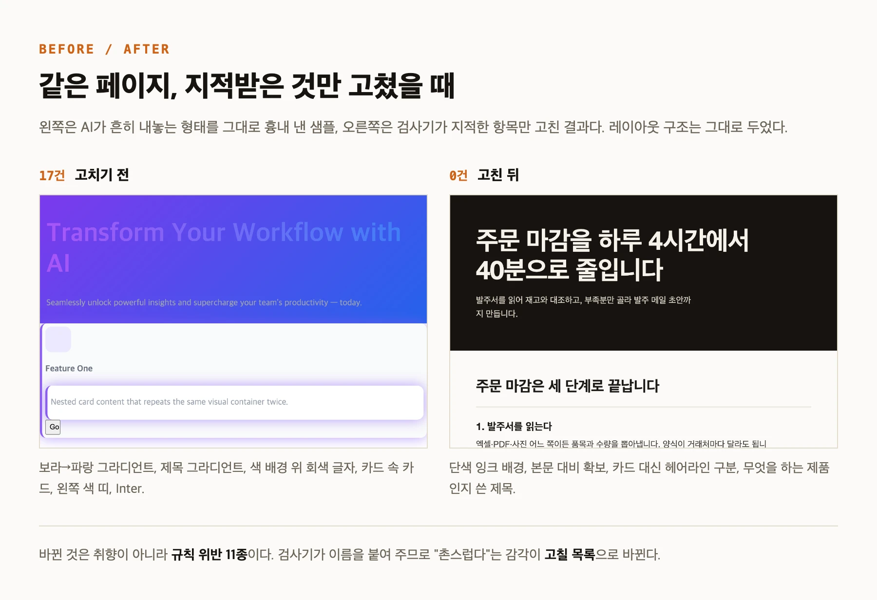
As a check, a single HTML page deliberately filled with the tells above was run through it. It reported 17 findings. Then only the flagged items were fixed: the stripe deleted, the heading gradient returned to a solid, the background made solid, body text contrast raised, the nested card replaced with a hairline rule, the typeface changed. The layout structure and the order of information were left untouched.
Run again: 0 findings. The image below is that before and after. If the right side looks better, what changed was not taste but eleven rule violations.
One more thing: how it inspects depends on the target. HTML gets static analysis including linked CSS, files such as JSX get pattern matching, and a URL is opened in a real browser to read the rendered screen. So a clean source scan can still miss items your deployed URL would catch.
You do not have to follow every rule
The list is a checklist, not a verdict. If the brand already settled on Inter, that is a decision, not a violation. In that case put an impeccable-disable comment in the file to waive it where it lives, or record the exception in the repository config. Either way you write a reason, so the next person does not have to ask why this one place differs.
Some items never count as failures to begin with. Findings classified as advisory are listed but do not change the exit code, so they never block automation. Check that distinction before wiring this into a pipeline.
In the end the value of the list is not that it standardizes taste. It is that a critique which used to be phrased differently every time now has one name. When the names line up, reviews get shorter and the same note stops being given twice.