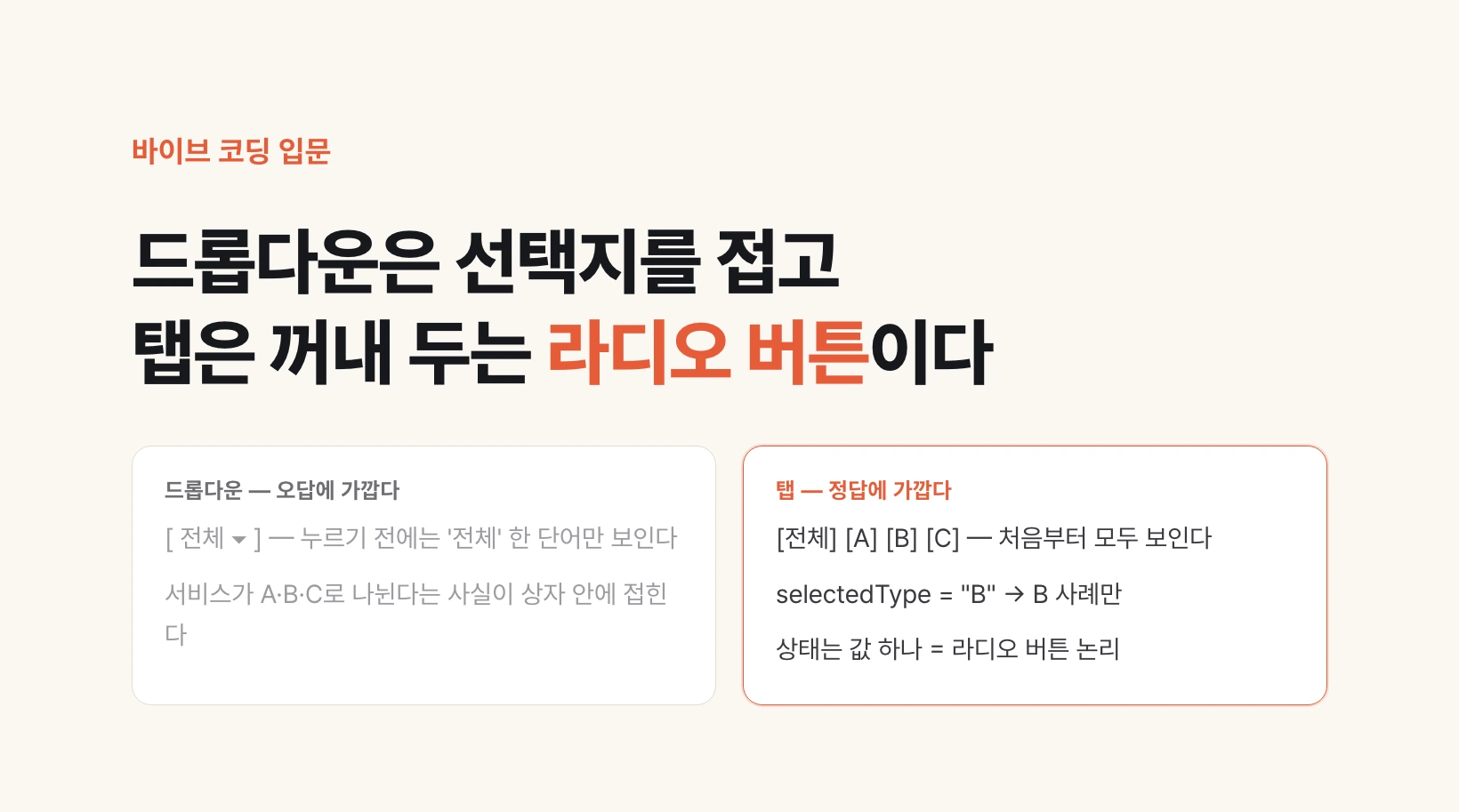
Why a dropdown filter is close to a wrong answer
The previous post covered the lecture's point that a consultation request form, the kind of sheet where you enter values and send them in one go, solves like a sudoku once you follow where the values get stored. The lecture then asks whether places that are not forms have right answers too. The example is the case section of a service introduction page, meaning the block, among the page's top-to-bottom sections, that collects customer cases. The company sells three service packages, A, B and C, and their cases line up as a row of cards.
Above the card list sits a filter. A box reads All with a downward chevron at its right, and clicking it unfolds All, A, B and C. Pick B, the box text changes to B, and only B cases remain. A select box that has to be clicked before its list unfolds is called a dropdown. It is a common sight and it works fine.
The lecture asks whether this is right or wrong. The yardstick is the section's intent. Cases are a kind of testimony. The spot exists to show cases for each of A, B and C so that the visitor wants to request a consultation.
Yet many visitors learn only at this section that the company's services are split into A, B and C. Even if the banner at the top of the page, the large promotional image area, introduces A, B and C one slide at a time, someone who scrolled straight down without swiping never saw them. The dropdown folds those three names back into a box. Unless you click, all you see is the single word All.
So the answer closer to right is to bring the options out from the start. All, A, B and C sit side by side, and what you are looking at right now is marked. The section's intent, that there is a split between services, comes across before anyone clicks.
| Form | Are the options visible? | Is what you are viewing visible? |
|---|---|---|
| Dropdown | Only after a click | Only as one word in the box |
| Options brought out | Side by side from the start | The chosen one stands out |
The data inside one card
The lecture goes one step further here. These cards hide data too. Case cards 1, 2, 3 and 4 reach the screen in one of two ways.
One is writing the content directly into the screen's code. Because the values are hammered hard into the code, it is called hardcoding. Changing a case means editing code. The other is showing values an administrator entered. When cases are registered on the admin screen, the screen only operators can enter, the values go into a database, the place that stacks values like a spreadsheet table, and the case list pulls them in and shows them each time. Just as the administrator checks consultation requests, cases usually work this way.
What do the values that come back look like? There are several cards, so it is a list. A list holding values in order is called an array, written by opening a square bracket and separating items with commas. Inside the brackets sit case 1, 2, 3 and 4 in turn.
Count the values one card needs: the case title, the client company, an image and a date. The View details button is the same on every card, so it is not a value. The image is a value unless it is fixed. To show an image on screen you need the address where it is stored, so each card carries an image address. A bundle of one card's worth of values wrapped in curly braces is called an object.
That is not everything, though. Pressing B must leave only B cases, so each card needs one more value saying which service it belongs to: a type value that never appears on screen. In short, the card list's data is an array holding several objects, and each object carries four visible values and one invisible one.
[
  {
    title: "Case 1 title",
    customer: "Client 1",
    imageUrl: "/cases/case-1.webp",
    createdAt: "2026-09-01",
    type: "A"          ← not shown on screen
  },
  {
    title: "Case 2 title",
    customer: "Client 2",
    imageUrl: "/cases/case-2.webp",
    createdAt: "2026-09-08",
    type: "B"
  },
  ...
]

Square brackets [ ] = a list (array), curly braces { } = one card (object)
What to show right now — state
Data alone does not finish the screen. When a visitor presses B, something has to happen that shows only B cases. For that, the screen has to remember somewhere which type it is currently showing.
That memory is called state. It is a value you cannot see, attached to the screen side. In spreadsheet terms, the values stacked in the table are the data, and the filter condition currently applied is close to the state. If data is what exists, state is which of it to show right now.
The state value can take two shapes. If several types can be picked at once, the state is a list. For All it holds A, B and C in an array; with A and C picked, A and C cases show; pick all three and it shows everything again. This is the same structure as the checkboxes on the previous post's consultation form, boxes where earlier picks stay while you pick more.
If instead pressing B must release A and show only B, and All is handled not as A, B and C all picked but as one separate option, the state is a single value. Picking another option releases the previous one: that logic is a radio button.
This is the thinking the lecture asks for. Looking at a filter, first ask whether it follows checkbox logic or radio-button logic. Once that is settled the shape of the state is settled, and once the shape of the state is settled, so is what to ask the AI for.
When several can be picked (checkbox logic)
selectedTypes = ["A", "B", "C"]   → All
selectedTypes = ["A", "C"]        → A and C cases only

When only one can be picked (radio-button logic)
selectedType = "all"              → All
selectedType = "B"                → B cases only
A tab is a radio button in different clothes
There is a familiar form that behaves much like radio-button logic: tabs. All, A, B and C sit side by side, and the one you press shows at the front. It also fits the earlier answer of bringing the options out.
Tabs can be built two ways. One prepares an All screen and separate A, B and C screens in advance and swaps in the matching screen on each press. The other keeps the inside identical to a radio button. The state holds only the one chosen type, the tab only handles showing the selected one at the front, and the card list below is redrawn whenever the state changes. They look the same but differ behind the scenes.
The lecture's conclusion is this. Much of the UI on a screen, meaning the elements people look at and press, finds its right answer to a large degree once you tie it to two kinds of data: data entered into the database, and data held in state.
Here is what to try today. Pick one filter or set of tabs in your own service or an app you use often and check three things. Are the options visible before anyone clicks? Is it clear what you are looking at now? Can you pick only one, or several? If you spot something to fix, ask the AI as below.
One problem remains: knowing which UI options exist for which intent. The next post covers why you need the names of those options, the component names, to describe a screen to an AI.
Before changing anything, show me two things.
1) What shape the case list data has (the field names of the objects in the array)
2) What value remembers the currently selected filter (the state's name and shape)

Then replace the dropdown filter above the case list with tabs.
- All, A, B and C are all visible from the start.
- Only one can be selected at a time (radio-button logic). All is its own option.
- The currently selected tab is clearly marked.
- Filter the card list by each case's type value.