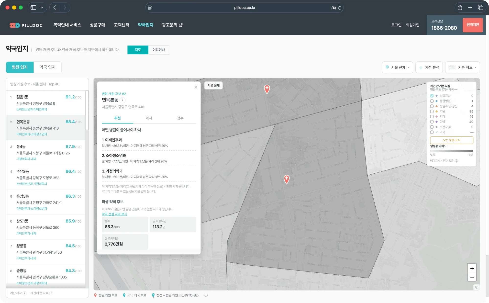
What the screen actually shows
PharmSite views the same map from two angles. The Clinic tab shows where a clinic could newly open; the Pharmacy tab shows where a pharmacy could newly open. The two are not independent — there is an order. The screen's logic is that clinics come first and pharmacies follow, so some pharmacy candidates only hold if a clinic that does not yet exist actually opens.
That is why selecting a clinic candidate also surfaces a derived pharmacy candidate beneath it: if that clinic materialises, a first-mover pharmacy slot opens in the same building. The map marks these conditional locations with a dotted outline.
The underlying data is the roster of licensed institutions from the Health Insurance Review and Assessment Service. The computation dated 4 August 2026 covered 19,923 clinics and hospitals and 5,915 pharmacies. Coverage is Seoul's 25 districts, and you can narrow down to the administrative neighbourhood below each district.
One property matters. These scores are not produced on the spot when you click; they are precomputed and stored, and recomputed when the HIRA data is refreshed. That is why a clinic that opened yesterday is absent. The Computed at and Data used footnotes at the bottom left tell you how old the numbers you are looking at are.
How to open it and where to click first
The address is https://www.pilldoc.co.kr/PharmSite, also reachable from the PharmSite item in the PillDoc site's top menu. It opens without a login or sign-up. Next to the page title are two tabs, Map and Guide. If this is your first visit, open the Guide first — pressing a blinking dot opens the explanation for that spot, so you can read the screen and its description side by side.
On the map screen, work in this order. First, pick your angle with the Clinic or Pharmacy tab. Second, narrow the area with the Region button at the top right; clicking inside a boundary on the map does the same thing. Clicking from the Seoul-wide view drops you into that district, and clicking the same district again drops you into its neighbourhood.
Third, pick a candidate from the list on the left. The list holds the 40 highest-scoring locations within the current view. Forty is simply how many fit on screen — locations outside the list can still be clicked directly on the map. The Pharmacy tab adds one more filter by the nature of the location: existing trade area, which draws prescriptions from clinics already open, and clinic-derived, which only holds if a clinic newly opens.
Fourth, selecting a candidate floats a detail panel over the map, with the map still visible behind it. Three ways to close it: the × at the top right, the Esc key, or clicking an empty part of the map.
What the score is made of
The score is out of 100, but it is not an absolute good-or-bad. It is a rank against other locations in Seoul. Each factor is converted into roughly where it places within Seoul before being summed, so 94 reads as roughly the top 6 percent.
The pharmacy location score is a weighted sum of four factors.
| Factor | Weight | What it measures |
|---|---|---|
| Prescription demand | 55% | Prescription volume likely to flow to this location |
| Clinic-adjacency and access | 20% | Distance to the clinic sending the most prescriptions |
| Competition | 15% | Other pharmacies splitting those prescriptions |
| Surrounding catchment | 10% | Population nearby |
Why prescription demand takes more than half
Because pharmacy revenue is dominated by prescription inflow. That weight was not chosen arbitrarily; it fell out of an earlier round of validation.
The model started from the common hypothesis: where pharmacies cluster, the area is saturated and therefore risky. Tested against prescription data, closure history, and population statistics, density explained neither revenue nor closure. The result held at district, neighbourhood, and radius resolution alike, with explanatory power effectively zero.
What changed direction was one remark from someone who knew the field: pharmacy revenue ultimately comes from the clinic next door, and prescription volume differs by specialty. Rerunning it with a prescription demand index — nearby clinics' prescription intensity divided by the number of competing pharmacies — separated revenue cleanly, with a twofold gap between the bottom and top bands. The 55 percent on today's screen is that finding hardened into a weight.
The same reasoning fixed how prescriptions are split. A clinic's prescriptions are not divided evenly among surrounding pharmacies but by distance, so closer pharmacies take more.
What the three tabs in the detail panel say
The detail panel is split into three tabs. The top line identifying the location — rank, neighbourhood, address — stays put as you switch tabs; only what sits below it changes.
A clinic candidate gets Recommendation, Location, and Score. The Recommendation tab ranks which specialty should move in. For the Myeonmok-bon-dong candidate, for instance, it lists otolaryngology, paediatrics, and family medicine in that order, each with daily prescriptions per clinic and the percentile of headroom left in that area. The ordering is headroom multiplied by prescription value, and specialties a pharmacy can follow are placed first.
A pharmacy candidate gets Prescriptions, Location, and Score. The Prescriptions tab lists the clinics sending prescriptions here, with distance, daily prescription count, and this location's share of that clinic's output, followed by revenue estimates. Monthly dispensing revenue is the dispensing fee per prescription multiplied by prescription count and business days; monthly OTC profit uses a rule of thumb per dispensing patient. The key-money reference band runs 13 to 17 times dispensing revenue, and a workable monthly rent is put at 20 to 25 percent of it. Source concentration closer to 1 means the location leans on a single clinic.
The Location tab looks at the building. It pulls the building register for name, principal use, floor count, gross floor area, approval date, and whether the ground floor is zoned for neighbourhood facilities, then lists medical facilities and pharmacies already in the same building. This is effectively where the decision is made: if a pharmacy is already there, most of that building's prescriptions go to it.
The Score tab holds the total and its basis. A radar chart shows what each of the four factors scored, alongside the number of pharmacies within 300 metres, the distance to the nearest one, and the surrounding population. The same total means different things depending on whether it came from high prescription demand or from an absence of competition.
When the location you want is not on the list
If you already have a storefront or listing in mind, you can drop a pin on it. Turn on the Point analysis button at the top right and click the map, or simply right-click the map without the button. The button exists because touch screens have no right-click.
The values that come back are not precomputed; they are calculated on the spot at that coordinate. The formula is the same as the candidate list, so the two are directly comparable, and you get both the pharmacy and the clinic view. Measured across six candidates, the stored and on-the-spot values differed by at most 0.2 points.
The point report also carries links to Kakao Map, its street view, and Naver Map. Building shape and what the street actually looks like are better checked there.
Reading more out of the map
The legend at the top right toggles existing facilities by type: tertiary hospitals, general hospitals, hospitals and long-term care and psychiatric, clinics, dental, oriental medicine, public health and other, plus pharmacies. Only tertiary hospitals are on at first, because clinics make up most of the total and turning everything on buries the candidate pins. Seoul has only fourteen tertiary hospitals, so most views show none at all — pressing Show all types below the legend turns everything on, and pressing it again turns everything off.
The grey shading over neighbourhoods is opportunity. Darker means higher candidate scores. It speaks in brightness rather than hue because hue is already taken by candidate pins and facility types. Beige neighbourhoods are not low-scoring but unscoreable: ten neighbourhoods where the population centroid could not be confirmed.
There are four base maps. The default draws labels and building outlines very faintly so the overlaid markers stand out; the detailed one adds colour and is better for reading the character of an area. The Kakao map packs in business and building names for matching real signage, and satellite is for checking building shape and entrances.
Markers read as follows. Pins are candidate locations and grow with score. A cross is a clinic already open, with colour for type and size for scale. A capsule is a pharmacy already open. A dotted outline is a pharmacy candidate contingent on a clinic opening, and faded markers belong to the tab you are not currently viewing.
How far to trust these numbers
The guide says the same thing twice, at the top of the page and at the bottom: every amount and count is a calculated estimate, not actual revenue or prescription performance. The values are not calibrated against outcomes, so they are unsuitable as the sole basis for an opening decision and should be read alongside on-site verification.
Three items warrant particular care. First, key money and workable rent are rule-of-thumb reference bands, not market quotes. Second, same-building matching only compares the base portion of the road-name address; floors and unit numbers are not distinguished, so whether the space is actually leasable must be confirmed separately. Third, because scores are precomputed, a recent opening or closure may not yet be reflected.
What the screen does is nonetheless clear: it narrows the shortlist. Only a handful of locations across Seoul can realistically be visited on foot, and this decides where to start from prescription flow rather than instinct. The final call still happens on site.