
HTML is boxes opened and closed with angle brackets — tags, head and body
Picture a website. At the top sit a logo and a menu; below them a large banner, a slider of case studies you swipe sideways, and a consultation request form. At the very bottom is an area gathering business details and a privacy policy link, called the footer. In a browser (a program that opens web pages, like Chrome or Safari) it all looks like a picture, but underneath there is code that writes this structure down. That code is HTML.
HTML settled on angle brackets. Write a name inside them, like <html>, and a box opens; put a slash (/) before the name, like </html>, and the box of the same name closes. That pair is called a tag. Other tags can go inside the box, so the outer tag is called the parent and the inner ones its children. The outermost parent is fixed as the html tag.
The html tag has two first children: head, which you cannot see, and body, which you can. The lecture compared these names to letter paper. Just as the top of a letter, where the logo and recipient go, is called the letterhead, head holds the page's basic information that never gets drawn on screen: what a search engine needs to understand the page, and links to other files the page pulls in. body is literally the body, the entire screen we see.
Two tags stand out inside head. The meta tag, which records the page's basic information, is an exception that ends as a single tag with no closing tag. The title tag opens and closes, and the text between becomes the page title shown on the browser tab.
You can look for yourself. Press F12 on any web page (in Chrome; on a Mac, press Cmd+Option+I or use the tools item in the three-dot menu at the top right) and a window called developer tools opens, showing that page's HTML. In projects built with vibe coding, though, you will rarely see raw HTML like this. These days code is usually built on top of another framework and assembled into HTML all at once when it goes onto the internet.
<html>
  <head>
    <meta charset="utf-8">
    <title>Consultation request</title>
  </head>
  <body>
    <!-- everything visible on screen goes here -->
  </body>
</html>
You can name tags anything, so why does everyone use the same names — semantic markup
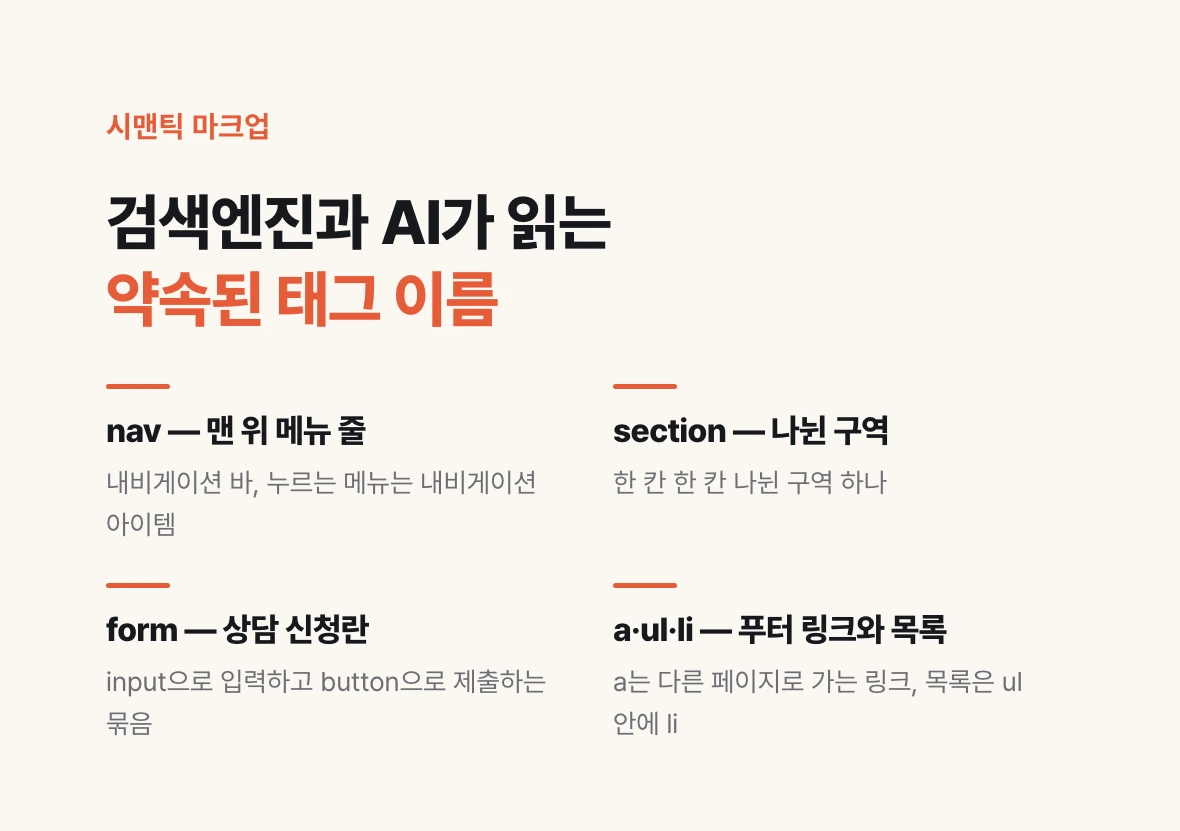
Tag names inside body will actually work whatever you call them. The lecturer's example was that he could open and close a tag named <yss> after his own initials. Yet open several sites in developer tools and the same tag names keep showing up.
The reason is search. In SEO (search engine optimization: making search engines find and understand your page) and GEO (generative engine optimization: making AI use your page as the basis when it answers a question), it matters that the page structure is written according to convention. Search engines and AI need to tell from the tag name alone whether a part is a menu or an input form. So a convention formed to use the names everyone uses, and that is called semantic markup (writing tags whose meaning shows).
Map it onto the website we pictured. The menu strip at the top is the navigation bar, each menu you click to move is a navigation item, and the tag is nav. Each separated block is a section. A bundle where you type, choose and submit, like the consultation form, is a form: the same form as in Google Forms when you build a survey.
Inside a form, the box for typing short text is input, and like meta it has no closing tag. A button you press is button. A form has a place to record where the values go when you press submit. A link that takes you to another page, like the terms of use or privacy policy in the footer, is a; for a list, the whole thing is wrapped in ul and each item is written as li.
Break the convention and the screen still renders. The convention is a signal telling whoever reads the page what each part means. Before vibe coding, people learned these names by using them, and the lecture says there are few enough that you get used to them after seeing them a few times rather than memorizing them.
| What you see on screen | Tag | Lecture example |
|---|---|---|
| Menu strip at the top | nav | Navigation bar with logo and menu |
| Separated blocks | section | Banner, case study slider, consultation form |
| Bundle to type, choose, submit | form | Consultation request form |
| Short text box | input (no closing tag) | Name, contact |
| Button to press | button | Send |
| Link to another page | a | Terms of use, privacy policy |
| List | ul (whole) · li (item) | Checklist |
Attributes and class — style grew too long, so it moved out to CSS
After the tag name, before the angle bracket closes, you can write more settings. These settings, written as name=value pairs, are called attributes. In principle you can name attributes anything too, but as with tags, there are names everyone commonly uses.
The most representative attribute is class. Start with why class exists. When there was only HTML, writing the structure was enough. But people wanted things to look better. Attach a style attribute to a div tag (short for division, a common tag for splitting the screen into blocks), write background: red, and that block's background is painted red.
The trouble was that decoration never ends with one background color. Inner spacing, borders, distance from other tags, whether to line things up side by side or stack them top to bottom: write all of that and a single tag grows endlessly long. People struggle to read it, and the same decoration repeats on page after page. So the decoration moved out into CSS (Cascading Style Sheets, a separate document holding only decoration), each decoration bundle got a name, and the tag now carries just that name. The place where that name goes is class. That is why, if you open any site in developer tools, almost every tag has a class on it.
Some attributes come with a special function agreed in advance. Give the img tag, which shows an image, a src attribute with an address, and the image stored at that address appears on screen. This ties back to the case study cards in part 06. If a card's image was uploaded by an admin, the image address in that src slot is also a value stored in the database (a place that stores values in rows and columns, like a spreadsheet).
<!-- writing decoration straight into the style attribute gets long -->
<div style="background: red; padding: 16px; border: 1px solid black; display: flex;">Menu</div>

<!-- move decoration out to CSS; the tag carries only a name -->
<div class="nav-bar">Menu</div>

<!-- img's src attribute = the address where the image is stored -->
<img src="https://example.com/case-01.jpg">
Components — names for frequently used parts like cards and dialogs
Just as tags have agreed names, screen parts have names everyone shares. These are called components. In the case study list from part 06, a box holding a title, client, image and date repeats; that box is called a card. There is no card tag in HTML. People simply agreed to call that shape a card. If you press submit with an input missing and a warning window pops up, that window is a dialog.
A component is a frequently used part, built in advance, for expressing some intent on screen, and there are enough kinds to list from A to Z. Whatever you build, you will almost certainly use them, so taking parts someone has already built is the standard way of developing today.
The one you meet most in vibe coding is shadcn/ui. The lecture explained the cn at the end of the name as short for className, that is, the class name from the previous section. Just as long style was bundled into class, it is a library (a collection of parts you take and use) of class-name bundles built in advance so they can be used component by component. Many collections do the same job under other names; Bootstrap, which the lecturer used heavily in the past, is one. Back then you memorized the class-name rules such collections used, and the lecture says that is no longer necessary. For the record, shadcn in the name is the handle of the person who made the library. Inside shadcn/ui's code, the utility function that merges class names is called cn(), so take the lecture's reading as a handy way to remember it.
You no longer need to memorize, but you do need the names. The lecture calls this UI (the on-screen elements users see and press) communication skill. Telling AI "show the case studies nicely" and telling it "list the case studies as cards, and if someone submits with an input missing, tell them with a dialog" get different results. Knowing part names lets you put the screen you want into words, and lets you point out what is missing in a screen AI built.
There is one thing to try today. Go to the shadcn/ui site (ui.shadcn.com) and open Components in the menu. Components from A to Z are listed. Click around and, one by one, ask what intent each part was built to express.
Observe the apps you use through data and state
Click through the components and a common thread appears. Most of them either handle data or change their look depending on data. The consultation form in part 05 followed the flow of saving input values to the database, and the case study filter in part 06 ran on state (state: the current selection a screen remembers) holding what to show right now.
This is the view the lecture recommends. Look at a screen with this laid down first: behind it is data stored in a database, and there is state that makes the screen display the way it does. Then the apps you use every day start showing many interesting things.
Open Airbnb and watch how the buttons inside behave. Open Threads. Open the apps you normally use and look closely at the UI working inside them. Ask things like: which data's array (a list of values wrapped in square brackets) is this list, is this tab a radio button (a button where you pick only one of several) that just looks different, and what state remembers the choice that is pressed right now.
When you pass what you observed to AI, write the component names together with the data and state. Below is an example request that does this for the case study card section from part 06.
This closes the Data Behind the Screen series. Parts 01 to 04 followed the ERD (a blueprint of which tables data is split into and how they connect) lecture to see how data is stored, and parts 05 to 07 followed the HTML lecture to see what shape that data takes on screen. The lecture closes by saying that knowing HTML is knowledge that keeps paying off in the planning and design of vibe coding. When you can describe a screen in terms of part names, data and state, what you hand to AI becomes that much more precise.
Build a case study section. Use shadcn/ui components.
- Show each case study as a Card. A card holds a title, client, image and date.
- Load case study data registered by the admin. Do not hardcode it into the screen.
- Each case study has a type value (A, B, C) that is not shown on screen.
- Above the card list, show All, A, B, C as Tabs out in the open. Do not hide them in a dropdown.
- Manage the selected tab as state, and allow only one selection at a time.