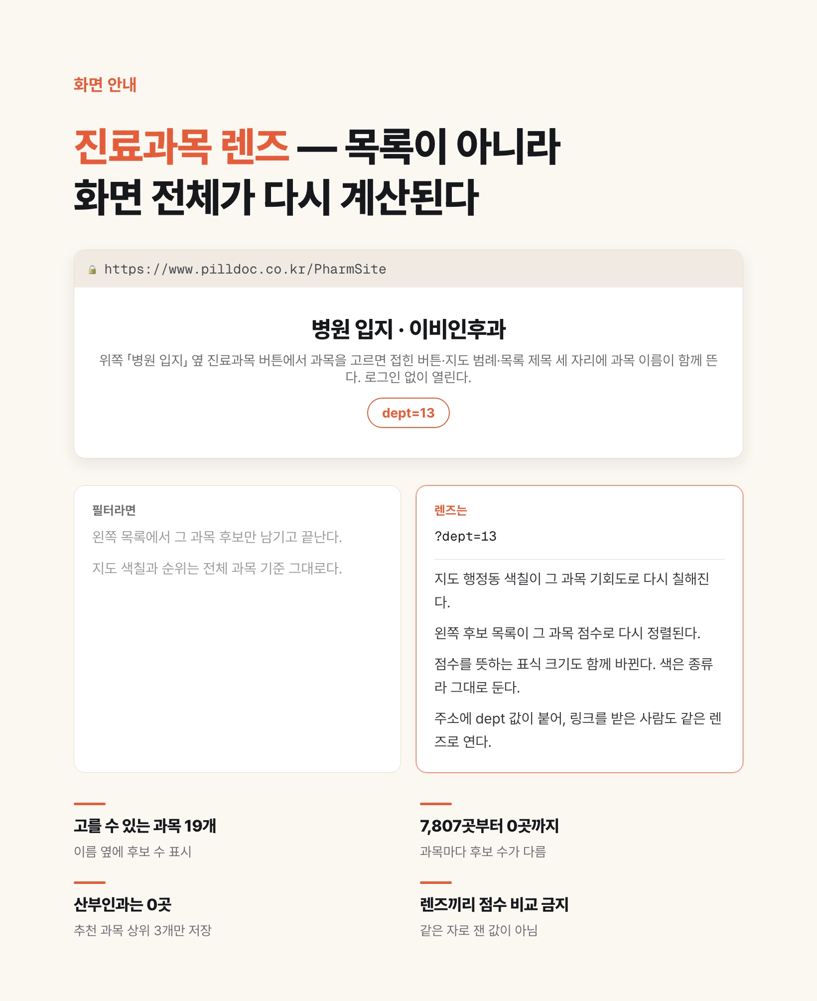
Where the lens is and how to turn it on
The address is the same as before: https://www.pilldoc.co.kr/PharmSite. No login, no sign-up. What changed is the top row. It used to hold two buttons, Hospital and Pharmacy. A third cell marked with a medical symbol now sits between them. That is the specialty lens, and it starts on All specialties.
Press it and a list of nineteen specialties opens. Next to each name is the number of candidates you can see through that lens. Specialties with zero candidates are greyed out and cannot be pressed. You learn what is available before you choose, not after.
Choose one and the panel closes immediately while the map and the list redraw. Three places then say the same thing: the collapsed button shows the specialty name, the legend heading on the right reads District opportunity · Otolaryngology, and the list title on the left picks it up too. If only one place changed, you would reopen the screen days later and have no way of knowing why the ranking looks the way it does.
The practical part is the address bar. Choosing a specialty appends a dept value to the URL — 13 for otolaryngology, 11 for pediatrics. Copy that link, send it, and the recipient opens the same screen with the same lens in place. Open this link and look at number three now means something.
Switch to the Pharmacy stage and the button greys out. Pharmacy candidates have no specialty axis; leaving it selectable would invent a category — an otolaryngology pharmacy — that does not exist. The chosen value is not discarded, though. Come back to the hospital stage and it is restored.
A lens, not a filter — what changes together
It is called a lens rather than a filter for a reason. A filter would keep the candidates belonging to that specialty and stop there. But a candidate site does not belong to a specialty. One location holds a fitness score as an otolaryngology site and another as an internal medicine site, at the same time. So the specialty is not a condition that trims a list; it is the basis on which the whole screen is recalculated.
Three things move together. First, the map shading. The screen paints administrative neighbourhoods in a single blue whose depth means score — the darker, the higher the candidate scores in that neighbourhood. A single hue by depth is deliberate: several hues would read as categories rather than as an order. Pick a specialty and this shading is repainted on that specialty's opportunity values.
Second, the ranking of the candidate list on the left, which is re-sorted on the chosen specialty's score rather than the all-specialty score. Third, the size of the markers on the map. Size means score on this screen, so when the representative score changes, size follows. Colour means type and is left alone.
The same logic put the control next to the stage buttons instead of above the list. Above the list it would read as we filtered the list, and you could not tell from the control's position why the map colour changed. The stage buttons say what you are looking at — hospitals or pharmacies — so the seat beside them is where through which specialty belongs.
Change the specialty and the top site changes
Numbers are faster than description. Here is a single district, Gangnam-gu in Seoul, with the lens changed four times, and what comes out on top each time. Figures are from the generation computed at 09:15 on 8 August 2026.
| Lens | Top candidate in Gangnam-gu | Score |
|---|---|---|
| All specialties | 2941 Nambusunhwan-ro | 72.4 |
| Otolaryngology | 26 Seolleung-ro | 67.1 |
| Pediatrics | 2912 Nambusunhwan-ro | 71.5 |
| Internal medicine | 474 Bongeunsa-ro | 67.9 |
Do not compare scores across lenses
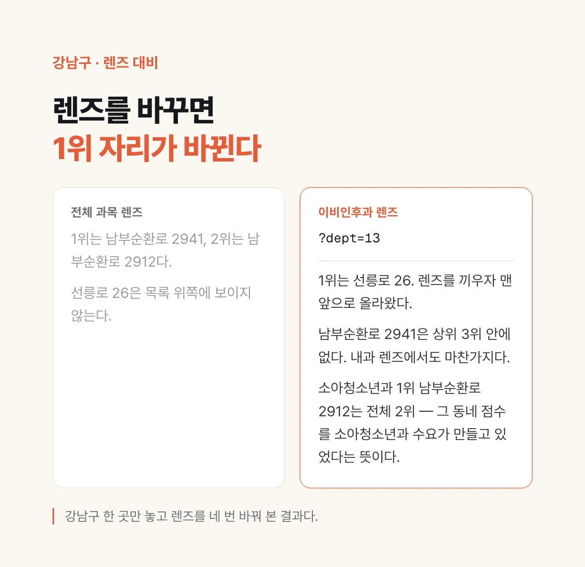
Two things are worth reading here. One is that 2941 Nambusunhwan-ro, the top site overall, is not in the top three under either the otolaryngology or the internal medicine lens. The other is the reverse: 26 Seolleung-ro, first under otolaryngology, was nowhere near the top of the all-specialty list until the lens was fitted. For someone who already knows their specialty, the overall ranking was hiding the answer rather than pointing at it.
Pediatrics, by contrast, tracks the overall ranking closely — its top site, 2912 Nambusunhwan-ro, is second overall. Read that as a statement about what was driving the area's overall score in the first place. Swapping lenses becomes a way of asking which specialty is generating this neighbourhood's number.
One caution. Do not read 72.4 against 67.1 as bigger and smaller. All-specialty scores and per-specialty scores are not measured with the same ruler. Each score is a rank against other sites in Seoul within that lens, so when you switch lenses, read positions inside a lens rather than the absolute figures across them.
How many candidates you can see varies by specialty
This is where most people are surprised. The candidate counts printed beside the specialty names differ by a factor of thousands. Below are all nineteen, as queried on 12 August 2026.
| Specialty | Candidates visible |
|---|---|
| Otolaryngology | 7,807 |
| Pediatrics | 6,881 |
| Internal medicine | 6,195 |
| Family medicine | 3,171 |
| General practice | 1,416 |
| Orthopedics | 1,040 |
| Urology | 1,001 |
| Psychiatry | 738 |
| Anesthesiology and pain medicine | 648 |
| Neurosurgery | 414 |
| Ophthalmology | 371 |
| Rehabilitation medicine | 128 |
| Cardiothoracic surgery | 104 |
| General surgery | 85 |
| Neurology | 55 |
| Tuberculosis | 20 |
| Dermatology | 15 |
| Emergency medicine | 1 |
| Obstetrics and gynecology | 0 |
Why obstetrics shows zero
Because each candidate site stores only its top three recommended specialties. If a site's three are otolaryngology, pediatrics and internal medicine, then no obstetrics score exists for that site at all. Under the obstetrics lens there is therefore nothing to list. That does not mean Seoul has no site suited to an obstetrics clinic; it means this generation of the data is not stored along that axis.
Here the map and the list part ways. District opportunity values are stored for all nineteen specialties, so even a specialty with zero candidates repaints the map correctly. Only the list on the left is constrained. That is why zero-count specialties are greyed rather than hidden. Hide them and the question becomes why is my specialty missing; show the count and it reads as not in this generation of the data.
The property changes how you use the screen. For thick specialties — otolaryngology, pediatrics, internal medicine, family medicine — scanning the list works. For thin ones, do not lean on the list: pick a neighbourhood from the map shading first, then use the point analysis tool to click the exact coordinate you had in mind.
The limits you have to read alongside it

A folded caution sits under the specialty panel. Press the information icon and it reads: 62 percent of physicians have an unrecorded specialty, and most large general hospitals are missing from the per-specialty aggregation. Competition near those sites may be computed lower than it actually is.
That sentence is useful because it names a direction. A disclaimer ending at this may be inaccurate gives the reader nothing to work with. Say which way it errs and the reader can correct for it. Here it means sites beside large hospitals may score generously because their specialty-level competition is understated — so shade those candidates down a little when you read them.
Everything stated in the previous article still holds. Every amount and count on screen is a model estimate rather than a recorded figure, and the key money and rent figures are rule-of-thumb ranges rather than market lookups. This is a tool for narrowing candidates, not for making the decision.
Finally, get into the habit of checking the age of the numbers. Scores are precomputed and stored, not calculated when you click. As this article is written the current generation was computed at 09:15 on 8 August 2026 and contains 19,930 hospitals and 5,919 pharmacies. The computation time is one click away at the bottom left of the screen.