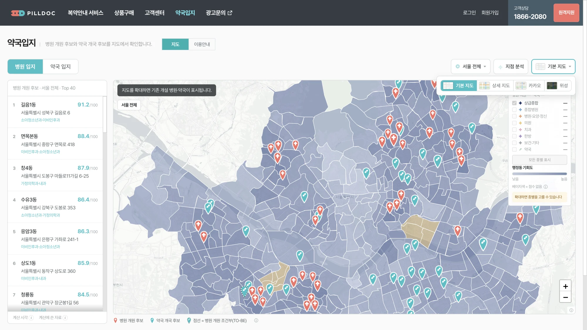
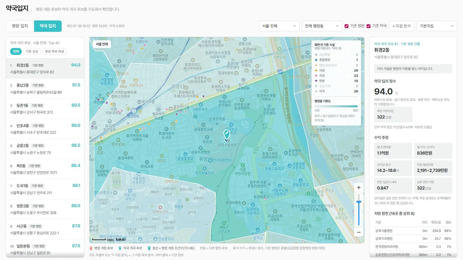
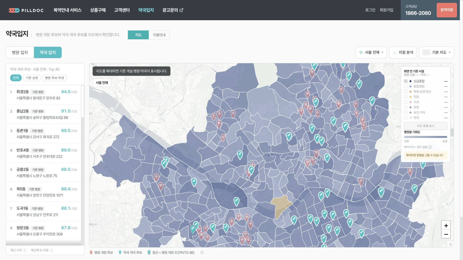
The same screen, six days apart
PillDoc PharmSite puts candidate sites for opening a clinic or a pharmacy in Seoul on a map, each scored out of 100. It opens without a login. By the end of July every feature already worked.
The two images below are the same tab (pharmacy candidates). July 31 first, then the same screen reopened just now. No feature was added in between — even the ranked candidates are identical. What changed is how much work the screen asks of the person reading it.
| July 31 | Now | |
|---|---|---|
| Toolbar controls | Two selects, two checkboxes, one button, one select — six laid out in a row | Three menu buttons, each showing its current value while closed |
| Choosing the base map | A select reading 'Base map' | One of four preview thumbnails |
| Computed-at and data volume | Always visible beside the tabs: 'Computed 07-30 16:12 · Clinics 19,911 · Pharmacies 5,903' | Two info icons at the foot of the list |
| How to read the markers | Two permanent lines under the map | One legend row and one info icon |
| Existing-facility toggles | Two toggles in the toolbar, with per-category counts sitting separately in the legend | No toggles. Merged into eight per-category checkboxes inside the legend |
| Candidate detail | Six revenue-estimate blocks and a prescription-source table, all expanded in the right column | A popup over the map with three tabs |
Principle 1 — when users are not technical, familiar beats good
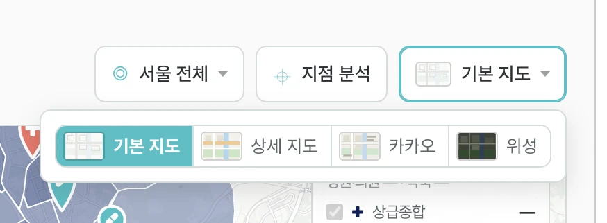
The people using this screen are pharmacists. They use map apps every day and have never once thought about how a map control should look. For them a freshly designed control is unfamiliar precisely because it was freshly designed.
So the reference was the map Koreans actually use: Naver Maps. Naver does not ask you to pick a base map by reading words. It puts small pictures of the map in that same corner and lets you choose one. The step where you read a label and then imagine what the map looks like disappears entirely.
PharmSite now does the same. Four options — base, detailed, Kakao, satellite — each with a small picture. The pictures are hand-drawn vectors, not cropped map tiles: storing and redistributing a map provider's tiles is against their terms, and spinning up four extra preview maps would cost load time on exactly the low-spec machines this screen was tuned for. So they are not photographs of each map. They are drawings that make the character of each map distinguishable, which is all the choice requires.
What you copy is the position and the method, not the picture
What was borrowed from Naver is not the artwork. It is two things: where the control sits, and what you use to make the choice.
Users finished learning those two elsewhere, so copying them costs the user nothing. Invent there instead and every user has to learn your screen once more before using it. Whether they will pay that cost is a question worth asking first. Pharmacists would not.
Principle 2 — group instead of listing, and a closed group must still state its value
On July 31 the toolbar held six controls laid out flat: district select, neighbourhood select, existing-clinics checkbox, existing-pharmacies checkbox, point-analysis button, base-map select.
The count was not the problem. The problem was that answering 'what am I looking at right now' meant scanning all six. Line up selects and the current state of the screen scatters across them.
Grouped, it came to three: region, point analysis, base map. The point is not that the number fell. The point is that a closed button now writes its own current value. The region button reads 'All Seoul', or 'Yeoksam-dong, Gangnam-gu'. You read it without opening it. Without that condition, grouping is just hiding.
Deciding what not to group mattered as much. The clinic / pharmacy tabs stayed exposed, because the fact that this screen has two modes is the first thing a newcomer needs; fold it and some users never learn the pharmacy mode exists. The two facility checkboxes went the other way — out of the toolbar entirely and into the legend on the map, because the meaning of a colour and the switch that toggles that colour belong in one place, and the legend already held that place.
Three rules, then. Put related things behind one button. Make that button show its current value while closed. Never group the control that tells people what the screen can do.
Principle 3 — do not expand everything; surface it on demand
The July 31 screen wrote down everything it knew. Computed-at and row counts sat permanently beside the tabs. Under the map, two lines explained that dimmed markers belong to the other tab, that marker size means score for candidates and category for existing clinics, and that right-clicking analyses that point. The right-hand detail column had expected prescription inflow, monthly dispensing revenue, monthly OTC margin, key-money reference, workable rent, source concentration and actual source prescriptions all open at once.
None of it is wrong. It is simply not all needed at the same time. A first-time visitor wants to know what the markers mean; a regular finds that same text eating map height on every visit. One screen has to serve both people.
So the permanent text moved behind info icons. Moved, not deleted — that distinction matters. Strip the reasoning and users lose any way to check an estimate. Now the icon beside the legend explains the markers, and two icons at the foot of the list answer when it was computed and what data went in. The screen got quiet and the evidence stayed.
The same principle applied to vocabulary. On July 31 one line read 'source concentration HHI 0.847'. HHI measures market concentration, and the reader here is a pharmacist. Anything that cannot be understood on one read does not belong in the screen's body text. Those terms now live inside the explanations, and a forbidden-term list is enforced by a test so they cannot leak back into the body — this is not the kind of mistake a person catches by eye every time.
Principle 4 — what every row shares belongs to the title, not the rows
The list holds forty candidates, and three facts apply to all forty: what they are candidates for, which area they were drawn from, and how many are shown. Write those on every row and the same phrase repeats forty times. A repeated phrase stops being information and becomes background — while still taking space and attention. It is not read, and it still costs.
So the title carries all three: 'Clinic candidates · All Seoul · Top 40'. The rows carry only what differs — rank, neighbourhood, address, score, recommended specialties.
Computed-at moved for the same reason. On July 31, 'Computed 07-30 16:12 · Clinics 19,911 · Pharmacies 5,903' sat at the very top beside the tabs. But what that freshness describes is not the whole screen — it is the scores in the list directly below. It now sits at the foot of that list as a single phrase and an icon. Put a fact next to the thing it describes and you no longer have to say what it refers to. No new component, no re-layout: this is the cheapest cognitive-load reduction available.
There is a bonus. Once the title states the scope, the region button reuses the same function that builds that sentence, which structurally prevents the title and the button from ever describing different scopes. Tidying the display tidied the state handling with it.
Why this is a vibe-coding problem
Nobody typed this screen line by line. A large part of the code was written by AI, which is why the features landed fast. Measured against the requirements, the July 31 screen was finished: candidates ranked by score, region narrowing, a detail view, arbitrary-point analysis. Everything in the spec was there.
What was not in the spec was the UI/UX judgment. Whether six controls become three, whether a base map is chosen by word or by picture, whether marker help is pinned or tucked behind an icon, whether a fact common to every row repeats on all of them or is stated once in the title. None of that comes out of 'build this'.
When the requirement is silent, AI produces the most common shape: controls listed in order, every field it holds printed on the screen. Not because that is wrong, but because it is the safe default — the option that never loses points for omission.
Which is why the faster vibe coding gets, the more UI/UX concepts you need. Once being unable to write the code stops being the bottleneck, the remaining bottleneck is the person deciding what to fold and what to keep. Another developer built this screen; the coaching at the end covered only the four items above. Those four took six days.
Four lines to hold against the screen you are building now
One. Does a control doing this same job already exist in the apps your users open daily? If so, copy its position and its method first. Originality is the next question, not this one.
Two. Are there more than four controls on one row? Group them. But a grouped button has to show its current value while closed. If it cannot, leave the controls as they are.
Three. Is there explanatory text permanently on screen? Ask whether users still read it after the first thirty seconds. If not, move it behind an info icon. Do not delete it.
Four. Is a word repeated identically on every list row? Take it out of the rows and put it in the list title.
None of these are features; they are all placement. Which means you can hand them to an AI — but only if you know the four yourself first. That is precisely the part of vibe coding a person still has to hold.
See it yourself
The screen opens without a login. At https://www.pilldoc.co.kr/PharmSite press the base-map button at the top right and principles 1 and 2 appear at once. The two icons at the foot of the list and the one beside the legend are principle 3; the list title is principle 4.
Every figure and count on the screen is a model estimate. Any real decision about opening a clinic or a pharmacy needs separate verification on the ground.